
Most brands treat branding and content as two separate jobs handed to two different people who never speak. That is how you end up with a beautiful logo nobody recognises three posts later. When Semper came to us, we did it the way it should be done, one continuous line from the name on the page to the post in the feed. Here is how that line was drawn.
The company: hospitality software that gets out of the way
Semper is a cloud-based property management system for the hospitality industry, hotels, lodges, guesthouses and resorts. It unifies bookings, front desk, rates and reporting in one place, automates the repetitive admin, cuts operating costs and backs it all with 24/7 expert support. The product promise is refreshingly human for a software company: manage your hotel with ease, focus on guests, not software. That single idea — technology that disappears so hospitality can take centre stage, became the brief that shaped everything we built. The product had grown up. The brand hadn't. Semper needed an identity that read as trustworthy, sophisticated and modern, plus a content engine to carry that identity into the daily scroll without diluting it.
The branding: one name, one promise, one dot
Strong branding starts with a reason, not a colour swatch. "Semper" is Latin for always, and in a category where downtime, double-bookings and clunky systems are the enemy, always is exactly the promise an operator wants to hear. Always running. Always supported. Always the right choice. So we anchored the identity in three words: one name, one promise, one dot that ends all uncertainty.
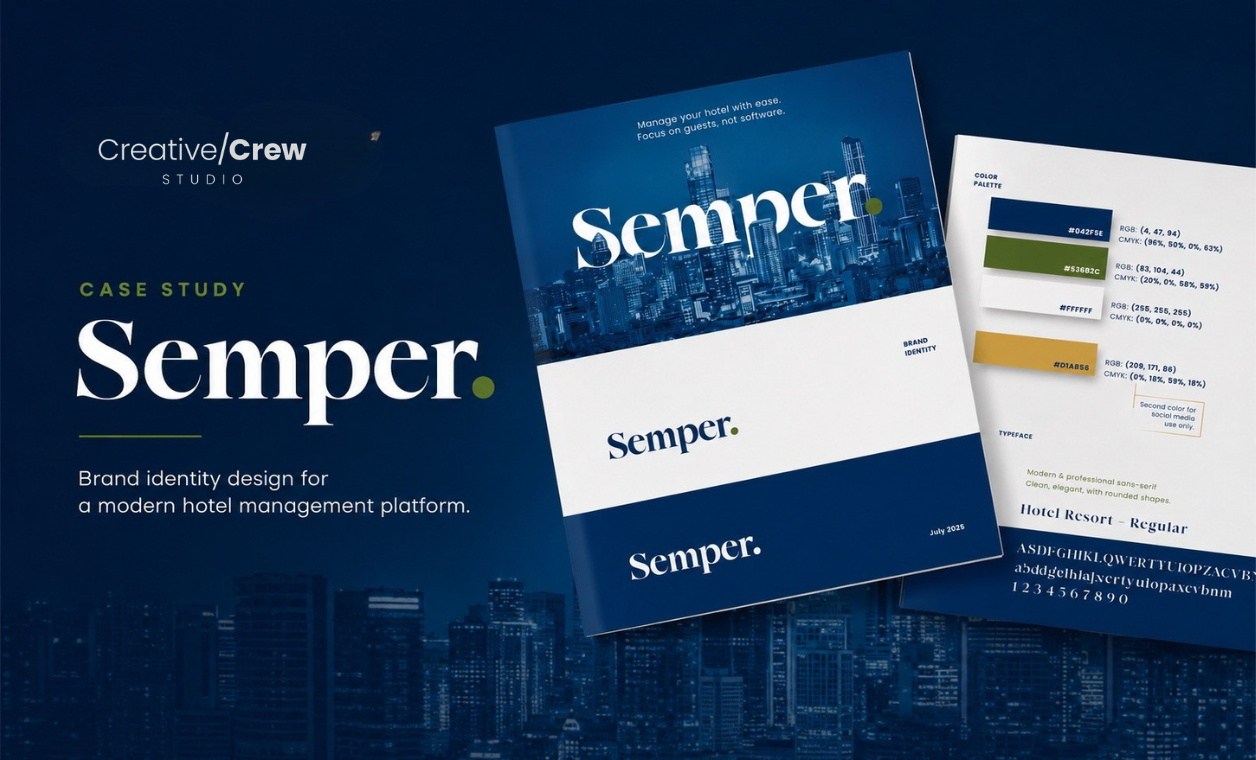
The Semper wordmark is elegant, rounded and confident, premium without feeling cold. But the signature move is the full stop at the end: Semper. That dot is not decoration; it is intention made visible. It signals the end of property-management headaches, clarity in every process and confidence in every collaboration. A small detail that carries the entire brand argument: this is where the search ends, the solution is found.
The colour system does the emotional work:
#042F5E) — stability, trust and tech-forward thinking. The backbone of the brand.#53682C) — nature, balance and calm, softening the tech edge so the brand stays welcoming.#FFFFFF) — space, clarity and breathing room.#D1AB56) — a social-media-only accent, reserved for the feed so the core identity stays disciplined.Typography stayed clean, modern and professional: an elegant display wordmark paired with a rounded sans-serif for everything else. A brand that mirrors the product, advanced technology that still feels approachable.
The content: turning identity into a feed people stop for
A brand identity that lives only in a PDF is a cost, not an asset. The real test of branding is whether it survives contact with a content calendar. We translated the identity into social content built on two principles: stay unmistakably Semper, and earn the scroll.
The first creative tackled positioning. Selling premium-but-affordable is a tightrope, so we said it with a wink: "Champagne software on a Pinot-priced budget, full-suite hospitality management without the premium price tag." The visual leans into the joke, while a Trustpilot 4.7 "Rated Excellent" badge does the quiet, credible work of proof. Wit on top, social proof underneath.
The second creative sold the function. We took one of Semper's strongest features, its AI-driven dynamic pricing, and made it impossible to misunderstand. Smart Pricing in three steps: set base rates, AI analyses demand, rates update automatically. Set against a warm, on-brand reception scene in navy and gold, it shows how the engine keeps operators competitive, fills more rooms and boosts revenue with minimal manual input, then closes with one confident call to action: book a demo today. Education first, conversion second.
Why branding and content have to be one job
These posts work because they were never designed in isolation. The dot, the palette, the always promise and the calm-meets-capable tone all carry straight from the brand board into the feed. Scroll past three Semper posts and you would know it was Semper without reading the name. That consistency compounds: recognition builds the memory that gets a brand shortlisted, a brand that looks the same everywhere reads as a company that has its act together, and a system defined once makes every future post, ad and landing page faster to produce. Branding sets the rules. Content plays the game. When the same team does both, nothing gets lost in the handoff — because there is no handoff.
Semper now has an identity with a reason behind every choice and a content system that can run for months without drifting. The name carries a promise, the dot closes the argument, and every post is a small, on-brand reminder of the same idea: with Semper, the search ends. That is what we do, purposeful design, strong communication and content that delivers results.
Partner with our experts to turn sustainability ambition into measurable impact.